Friday, 31 January 2014
Thursday, 30 January 2014
Evaluation Question 3 - What have you learned from your audience feedback?
From
the feedback that we gathered from our audience in the initial stages of
production, we found that the majority of people liked the slow motion effect
on the shots that was used. They felt that it was visually very effective and
also fitted in well with the chosen genre and the slow tempo of the song. As
this feedback was collected in the very early stages of productions, we
had many criticisms made and we used this to improve. Some criticisms include
shots that felt that they were out of place or just didn’t fit in with the
music video.
Audience
feedback
Positive
feedback
·
Good lipsyncing
·
Narrative matches
with slow lyrics
·
Good contrast
between Black and white and the colour shots
Negative
feedback
·
Opening too dark
·
Shaky scenes
·
Lighting too dark
in the bedroom
·
Shot that is way
too shaky – get rid of it!
·
Unfinished
What we shall do to
improve
·
Work on the
lighting in the post production, if this does not work we shall re film scenes
·
We shall get rid
of the shaky scenes and replace them with stable scenes
·
We shall complete
the music video taking into consideration the criticisms given
Audience feedback
Positive
·
Great mise en scene
·
Good lighting in shots
·
The narrative is clearer than before
·
Effects work well
·
Good use of fade to black at the end
Negative
·
Strange bathroom shot
·
Bad sound quality
·
Out of sync piano shots
Improvements
·
We shall cut out the bathroom shot
·
Re sync the piano shots extending them or
cutting them to make sure they are in sync and that it doesn’t affect the rest
of the video
·
Replace the sound to a higher quality
Thursday, 23 January 2014
Evaluation Question 2 - How effective is the combination of the main product (your music videos) and ancillary tasks (digipack and magazine advert) ?
How effective is the combination of your main product and
ancillary texts?
The themes used within our main product
and ancillary texts link together because of the constant use of similar
colours and images. Ben Pavitt, The artist, is shown in the same costume in the
digipack images as in the video.
The biggest aspect that links the music
video, digipack and magazine advert is that the main images are all in black and
white and are taken from the location of the music video. This will make
the promotional package more recognisable as they match.
We decided that we would use the outdoor image of the artist without the party scene to make the minimalistic look of
the ancillary tasks more prominent. The reasoning
of this is that we could make the products link better as the black and white images will be the first part you see when looking at the products. This also gives more reasoning to the
black and white shots in the music video as it highlights to the isolation
within all the shots of the artist in comparison to the vivid coloured shots.
The fonts used for the digipack match the magazine advert fonts to
show consistency between the two. However, we wanted separate fonts for the artist’s
name and the album to make them more prominent on the ancillary tasks.
The use of black and white is shown within the music video and is
seen on both ancillary tasks. This allows consistency throughout the whole
promotional package. The photos in colour of the party has the
same colouring as to what we used in the music video. This is to link the digipack and the music video together.
Wednesday, 22 January 2014
Evalation Question 1 - In what ways does your media product use, develop or challenge forms and conventions of real media products?
Question 1 - In what ways does your media product use, develop or challenge forms and conventions of real media products?
When creating our media product, we looked into the generic
conventions used in real media texts from the same genre. This gave us a greater
understanding of what is classed as stereotypical within the music genre.
Our media product follows the generic
conventions of our chosen genre. This can be seen in all three parts of the
promotional packages.
We looked at the
music videos that was in the same genre and style of artist and looked at the
shots that they used in their own music video and used them in our own.
The biggest inspiration for our music video is the video for ‘Closer’
by Tegan and Sara. The location of the music video and the themes in the video are
very similar. The idea for the trampoline shots in our video was taken from
this.
While analysing this and other videos within the genre we noticed
that the shots were very controlled and slowed down to add dynamics, which is
what we replicated in our own video.
This shot of Ben on
the floor was a lot like the shot used from the music video ‘This is gospel’ By
Panic! At the Disco.
This is also seen in
the music video for ‘the only exception’ by Paramore, this is shown here;
From looking at the
genre I noticed that there seems to be shots of the artist and then the
narrative in the same setting, this can be shown in the music video ‘Royals’ by
Lorde.
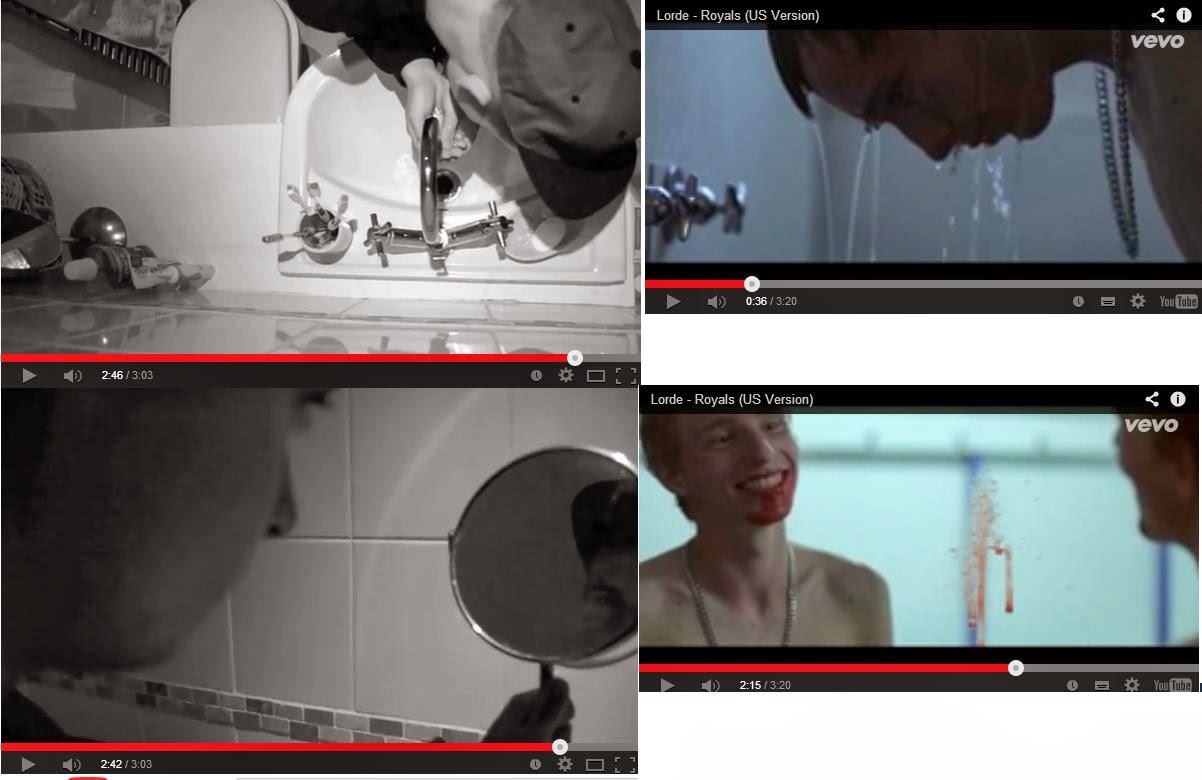
The bathroom shots
and the mirror shots were inspired by the shots in this music video. This music
video was a great example to our own video as it had a slower song and mediumistic
settings and shots. Slower, on the beat shots were also used in this video. This
gave us the inspiration to use slower shots also.
There were only a few actual shots that have been used as
comparison against our own from this video, but the others were used as
inspiration. These can be shown here:
Tuesday, 21 January 2014
Digipack and Magazine advert - My design
Audience feedback had told me that my other design wasn't fitting
within the music video. Therefore, we took some pictures while filming for
promotional usage and I used them to link in with the digipack and the magazine
advert.
I felt that lining up the album title with
the artist eyes would stand out and make you eyes draw to the centre of the
advert.
From the audience feedback that I received
from this, people said that they both link together well and match the sombre
feel of the music video.
If we were to use this for our final
design, it would need to have much more information on the back of the digipack
and the advert needs to have the correct information on it as well.
Wednesday, 4 December 2013
Magazine advert idea - Galaxy Theme
For the magazine
advert I've used the border pattern that matches the Digipack that I have
designed I've followed the conventions that I have seen by analysing
other magazine adverts and made the album name the biggest piece of text and
centred in the middle of the page. The next biggest pieces of text are the
artist name and the 'out now' to show how that they are the next most important
bit of information on the advert. Underneath 'out now' we have the websites and
record companies that correspond with the artist which will be used for the
audience to look into more information about the album and artist.
Throughout this whole
design I haven't used the artist in any of it. The reason for this is to
connote that the album is completely about the music rather than the star
image. The fonts used match throughout the products and tie in with the theme.
I really like this theme and I plan to create another theme for a digipack and a magazine advert and then ask people which one they prefer. I feel that getting the publics opinion on the look of the products will be beneficial as they are who we are selling the products to.
also as the pictures are not mine I cannot use it for the design.
Monday, 2 December 2013
Digipack idea - Galaxy theme
The use of the galaxy theme is common within the genre of our artist and the target audience.
Here are clothes and accessories that copy the same theme and pattern.
So I figured that it would be eye catching to our target audience.
Here are clothes and accessories that copy the same theme and pattern.
So I figured that it would be eye catching to our target audience.
The top four are the design for the outside where the bottom four are the decoration for the inside, the black ring signifies where the disc would go.
Its simplistic but effective and it is easy to create pictures that match
I feel like we need to add the singer into our Digipack and for our advert have the same picture of Ben with a border of the Galaxy print from our Digipack.
as there are no pictures that we have taken I cannot use it for our final design.
Wednesday, 20 November 2013
Rough idea design of the Digipack
This is a quick design idea for our digipack, it follows the same theme of lights and Ben features in two of the four. I felt that if he was in all four, the audience would think that its just completely about him rather than the music.
the theme are lamp posts that are on so all shots are in the dark, illuminating Ben connoting that we can only be truly seen in our darkest time.
Friday, 8 November 2013
Thursday, 24 October 2013
Viral videos
Viral videos are a phenomenon that is where a music video gets incredibly popular online and gets millions of views on sites such as YouTube. The most recent videos that have taken the internet by storm are Psy with ‘Gangnam style’ Rebecca Black’s ‘Friday’ and Yivis with ‘What does the fox say’
All these videos have created world wise success for novelty songs. The main conventions throughout these songs and videos are:
• A chorus that sticks in your mind
• Simple lyrics
• Dance routine that is featured in the video
• Usually with the dance routine, an iconic move
• Usually from foreign country’s or the music is not in English
When YouTube wasn’t a used platform, there were songs like this that made big in the charts. Examples of this are, ‘The ketchup song’ ‘The Macarena’ and ‘The fast food song’ all three fit the criteria of a viral video.
Viral videos also create a following filled with parodies and people filming themselves dancing the routine and so on. These videos get the same hype as other music videos (if not more) but usually just through the internet.
From looking at the videos that are considered viral and what would have been considered viral if they were realised today, you can see they still have simple but effective videos and still get the audience that they want; this will help us as we now know that we can create a video that is simple but effective.
All these videos have created world wise success for novelty songs. The main conventions throughout these songs and videos are:
• A chorus that sticks in your mind
• Simple lyrics
• Dance routine that is featured in the video
• Usually with the dance routine, an iconic move
• Usually from foreign country’s or the music is not in English
When YouTube wasn’t a used platform, there were songs like this that made big in the charts. Examples of this are, ‘The ketchup song’ ‘The Macarena’ and ‘The fast food song’ all three fit the criteria of a viral video.
Viral videos also create a following filled with parodies and people filming themselves dancing the routine and so on. These videos get the same hype as other music videos (if not more) but usually just through the internet.
From looking at the videos that are considered viral and what would have been considered viral if they were realised today, you can see they still have simple but effective videos and still get the audience that they want; this will help us as we now know that we can create a video that is simple but effective.
Tuesday, 1 October 2013
Pitch idea- Seven Days by Craig David
This activity will help us to make our own music video have a relationship to the lyrics and help us improve our ability of doing this by looking at other songs from various artists and genres.
This is my pitch idea for Craig David's song 'Seven days' the analysis of the lyrics creates a clear visual that could be shown as a narrative music video. Looking at this genre, as it is different to our own, helps us understand the lyric analysis better as we have less knowledge of the generic conventions. It also allows us to work with just our own creativity and imagination to come up with a pitch idea.
Tuesday, 2 July 2013
Lyric analysis and their importance
Most music videos contain a narrative. Usually the lyrics within the song are used to either reflect or help enhance the emotions conveyed in the narrative; this is why analysing lyrics is important. Without looking at the lyrics before planning out and pitching a music video idea, your vision and lyrics could clash and not complement each other.
According to Goodwin's theory, the lyrics and the visuals should match at some points. Looking back at music videos that i have analysed, I have noticed this and it has made me think about the lyrics to our own song and how we can incorporate Goodwin's theory of the relationship between the lyrics and visuals and execute it in our final video.
Monday, 1 July 2013
Magazine advertisement 2
Media Language: the biggest text on the advert is the date of the album 'Out 11th Jan' telling people that it is going to be out on this day, preparing people to be able to buy it; and the name of the band 'all time low' this tells the audience of the band and could attract new audience. this are the two most important pieces of information the next biggest text on the advertisement is the album name. this is located under the band name so naturally your eyes will lower down the page. The information on the page is the most important bits of information because this is what the general public will see and you need to make this information stick so people will be interested. If there is a lot of information that is unnecessary then the audience wont pay attention to what is needed. the bottom of the poster contains the formats you can buy it on and a website to buy a physical copy online. his will help boost sales because people now don't need to leave their home to purchase the item.
Representation: the bright colours at the top of the advert connote an upbeat and lively album while the band name being held up by tape connotes that they are down to earth and still thinking about their early days of playing when they were unsigned and focusing on the music rather than their fame. the use of the black at the bottom makes the information stand out and it complements the bright colours above. No members of the band are shown which shows that they are more focused on the music rather than the look of the band.
Institution: the website for the band are at the bottom of the advertisement. this allows the audience to explore the band and find out information about them including their other albums and up coming dates. this advert was taken from kerrang! which is a magazine that is sold in many public shops and therefor has to be non offensive as children could read it. Using non-offensive advertisements will allow more public coverage as there are less barriers to get past.
Audience: The age range for You me at Six is around teenagers you young adults of all genders. The bands advertisements have been in many magazines such as 'Q' magazine and Kerrang! magazine. Kerrang! is for a younger audience where as Q is for a much older target audience. this tells me that they want to extend the age range of their audience by publicising in many different places. The look of the magazine advert connotes how it is not aimed at a specific gender and the colour almost gives a visual representation of their own music.
Magazine advertisement analysis 1
The advert that I have analysed is for Panic! at the Disco's album 'Pretty Odd'
Media language: The biggest text on the advertisement is the Band's name. This will make it clear that this is who the album is by. Underneath this is the album cover with the album name 'Pretty Odd'. This will tell people what to look out for in stores. The next biggest chunk of text is 'The new album in stores march 24th' which will let people the most vital information for selling the product, when it is available to buy. This is crucial otherwise their sales would be less than expected. Most of the page is covered by the album cover and the name of the band. The rest of the page complements the album cover making it all match and look good together. At the bottom of the poster it features social media links such as their own website and record company and their site. it also talks about the deluxe version available only online and the latest single from the album is mentioned to help boost sales as people who like the single will most like the whole album and buy it, increasing sales.
Representation: The
imagery is bright and colourful using pastel colours, giving it more of a
vintage look. The use of the flowers and butterflies connotes a calmer, softer
rock style of music compared to the last album. In my eyes it reminds me of the
60's/70's with the flower power era. Therefore I feel that he music will
be based around this era with more calmer tones. the dark purple and gold complements each other making a good base for the rest of the colourful album art to go on top.
Institution: The
record company and additional information on the bottom of the poster allows
the audience to look into more detail of the band and the album, and the record
company can be searched to see any other artists with the same genre
as Panic! at the Disco. There is nothing offensive on this poster and
it was shown in the music magazine kerrang! This is sold in shops that
anyone can look at, which makes it suitable for children to see.
Audience: the
target audience for Panic! at the Disco is around ages 13-25 which is quite
wide. As each album had a different overall sound the target audience changes
between each. Someone may prefer one album style to another. Magazines such as Kerrang!
Which is for a slightly younger audience and NME which is suited for a slightly
older audience have reviewed this album and the bands others, this implies that
these magazines would have this advert inside one of their issues. As there are
no pictures of the members of the band on the advert, this connoted that
they are more about the music than their image and want to be taken seriously
as a band. From the overall look of the advert the colouring and
style would suggest that the marketing for the album is focused on a more
stereotypical female audience. Although their target is usually a mix
between both genders and their music appeals to both.
From analysing the advert, I now know what to look for in
our own music advert.Sunday, 30 June 2013
Digipack analysis 2
From analysing this Digipack I feel that we could easily make an easy but effective Digipack that is simplistic and black and white.
Digipack analysis 1
From looking at this I feel that I need to make sure that our own Digipack fits a running theme and stands out an fits the Genre.
Saturday, 29 June 2013
Notes on what a digipack is and magazine adverticement are and their importance
Digipak research
The Digipak is an alternative style of packaging for CDs and
DVDs compared to the well-known jewel case. It’s used frequently with bands for
special edition or DVD + CD combo packs and fold out to look more like a book
than a basic CD case. Digipaks usually have range of two to six fold out panels
that contain pictures, discs and a place to contain booklets or a poster.
For our Digipak we plan to create four pages that carry the
same themes, style and shots that will be used in our music video and our
advertisement. This will make our products have a uniform and that the market
will know that they are all associated with each other.
Digipaks are also environmentally friendly and are usually
made out of various recycled materials.
Although Digipaks are made of other materials than plastic,
it won’t crack. However, the plastic teeth that you would find on a jewel case
are still used in Digipaks and are very likely to get damaged and won’t hold
the disc safely.
They are important as they are a modern way to sell the
product in a more exciting way.
Examples of Digipaks

Magazine adverticement research
A magazine advertisement is to help promote the artist and
make the product sell; this is usually a single, album or upcoming tour. When one
product is being sold, it will link to the others making them sell also, for
example; when an artist is doing a tour which is by the name of their album, it’ll
automatically make the audience want to buy the album so they know what they
will be going to see. The Artist P!nk has done this by touring ‘the truth about
love tour’ which is also the same name of her latest album.
The magazine advert will also have similar images throughout
for example, the tour advert using pictures from the same shoot as the album. Most
artists and record companies will do this to show that it is part of a set and
will want to make the audience buy more products.
Here is the cover for the album ‘the truth about love’ on
the left and on the right is the advert for the tour of the same name. as you
can see, the picture of P!nk is the same on both.


Both Digipaks and advertisements are important because they
sell the product that the record company are producing. When we create our advertisement
and Digipak we shall make it have a running photo theme and make them
complement each other.
Friday, 28 June 2013
notes on Cultural effects model and how it applied to a music video
If the same media messages are repeated often enough they will be
accepted as fact. However, audience members can resist these messages.
The cultivation effects model also
suggests that the audience are active and can 'decode' messages in media texts
in a number of ways. People’s responses are affected by their social
background.
There can be different types of readings:
dominant, negotiated and oppositional.
We need to make our music video memorable
all the while making it so that no one forgets the name of the song and the
artist.
Using the cultural effects model, this
will help us as we can use it to make the artist look like he has a star
quality or makes him 'the good guy'. Cultural effects model makes the audience
think what the producer wants them to think.
Here is a music video of the Katy Perry video 'Last Friday Night'
as you can see it’s a party style setting and a lot of alcohol is being shown
and drunk. Also the lyrics depict a scenario where they have drunk so much that
her house is a mess, she can't remember much from the night before and has done
many acts without thinking about the consequences. This high amount of drinking
and the events occurring is being exposed to younger audiences, giving them the
perception of it being normal and giving them a false reality of drinking
without them knowing about the consequences and effects of it; making the
audience think that drinking excessive amounts of alcohol is just a regular
occurrence, and should be done every weekend.
From this, I feel that we need to stay
clear of sending out wrong messages in our music video and have a lower amount
of exposure to drinking and other mature themes.
Thursday, 27 June 2013
The importance of lip syncing
Lip syncing is crucial in a music video. It gives the artist screen time and helps them achieve star appeal. However if lip syncing is done badly, it can really change the effect of the video. If performed well it can make a whole music video come together.
This is a music video that contains a lot of lip syncing and shows that it is a tricky thing to do and we have decided that w shouldn't use much as it could take away the quality of the music video if the lip syncing is not good.
Wednesday, 26 June 2013
Indepth analysis of 2 Videos from your chosen Genre
The Characteristics for the genre
The genre for this band is Indie rock a lot of the music videos contain narrative in this genre and there is less of a narrative in this video however it is still apparent. for this genre, the use of party locations and fairy lights are seen in many videos.
Relationships between the lyrics and the visual
In the music video, you see the lyrics of the song appear on a television screen. you also people kissing and hugging which relates to the name of the song 'closer' and the line 'I want you close'
Relationships between the music and the visual
People within the big party shots are dancing to the beat of the music, the shots cut on the beat also and during the bridge of the song, the shots slow down as the style of music changes.
Close ups of artists
There are many shots of the artists close up in the shots. throughout the video, most of the shots are both girls and some are single shots the the artists.
Reference to the treatment of the female body
ladies do appear in the music video but are not dressed in provocative clothing. however they are seen in fairly intimate situations along with many other people in the video.
Characteristic for the genre
The genre for the artist is said to be electro or pop whereas the genre for the song 'royals' is minimalist pop. There is a slight narrative between the two boxer characters but it is not very clear.
Relationships between the lyrics and the visual
The lyric 'It don't run in our blood' from the chorus is sung and then a shot of one of the boxers with a bloody face and mirror.
Relationships between the music and the visual
The shots are cut onto the beat of the music and seems to be on the beat throughout the music video.
Close ups of artist
There are many shots of the artist in this music video, some include lipsyncing and some just include her looking at the camera.
Reference to the treatment of the female body
The only female in the music video is the artist and she is not wearing provocative clothing or used for male gaze in any way.
This has helped me understand what the genres of our own music video contain, now we can use these to work on our music video.
Subscribe to:
Posts (Atom)